



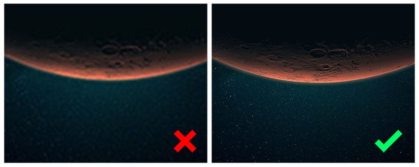
Avoid: Using images with low DPI (dots per inch).
Tip: Always use high-resolution images (at least 150 DPI) for clear and crisp prints. Advise clients that using low-resolution images can lead to pixelation and compromise the overall impact of their designs.
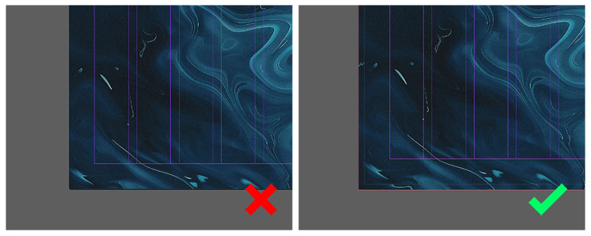
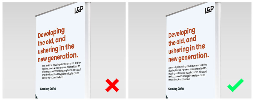
Avoid: Leaving important elements too close to the edge.
Tip: Always include a bleed area (usually 3mm to 5mm) to prevent white borders after trimming. Remind clients that extending their artwork into the bleed area is essential for a professional finish.
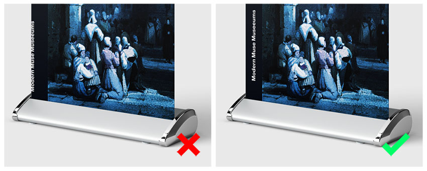
Avoid: Placing crucial elements (text, logos) too close to the cut line.
Tip: Keep all essential elements at least 20mm inside the cut line to prevent cropping. Encourage clients to be mindful of this to ensure that nothing vital gets cut off.
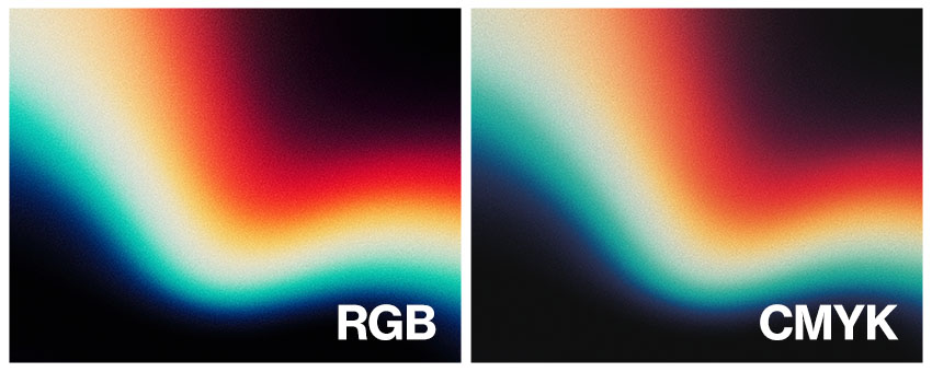
Avoid: Designing artwork in RGB, which can lead to colour discrepancies in print.
Tip: Use CMYK colour mode for accurate colour representation in prints. Clients should be informed that RGB may look vibrant on screens but won’t translate the same way in print.
Avoid: Using fonts that are too small or overly complex.
Tip: Ensure the text is large enough to be easily readable from a distance. Suggest to clients that simplicity can enhance clarity and impact.
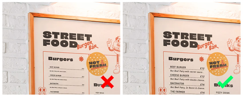
Avoid: Misaligned graphics or text that can look unprofessional.
Tip: Always double-check the alignment of elements for a polished look. Clients should be reminded that misalignment can detract from their design’s overall quality.
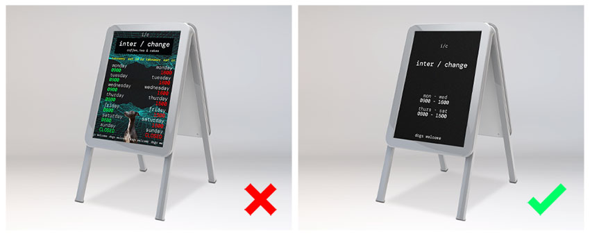
Avoid: Overloading designs with multiple elements.
Tip: Stick to one or two complementary fonts to maintain consistency and readability. Encourage clients to keep patterns and colours consistent with their brand for a cohesive look.
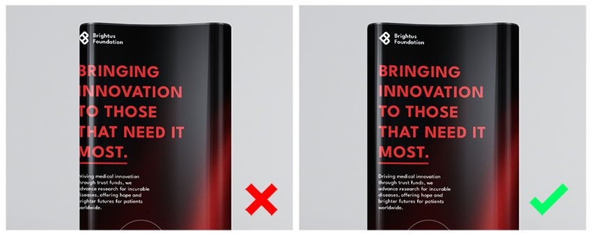
Avoid: Ignoring how the design will look on the final product (e.g., banners that wrap around).
Tip: Visualise the layout in context to avoid losing key information in folds or curves. Advise clients to consider the final application of their designs during the creation process.
Avoid: Sending designs without checking for typos or errors.
Tip: Always proofread text and consider having someone else review it for a fresh perspective. Clients should understand that a small oversight can lead to costly mistakes.
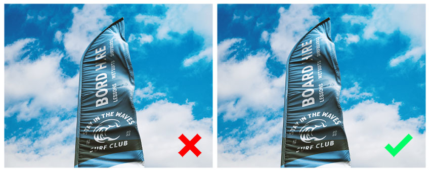
Avoid: Sending files to print without a thorough review.
Tip: Take the time to review artwork and consider getting a second opinion. Remind clients that this step is crucial for ensuring a high-quality end product.
Do Use Our Free Templates
Take advantage of downloadable templates to ensure designs meet the correct specifications for size and bleed, making the setup process smoother.
Do Read Our Blog for More Information
Stay informed by reading our blog, where you can find valuable tips and best practices for preparing artwork for large format printing.
Do Speak to Our Team
Don’t hesitate to reach out to our studio team of artworkers. They’re here to help with any questions and provide a free 30-point artwork check to ensure designs are print-ready.
Preparing artwork for large format printing doesn’t have to be a daunting task! By following these best practices and avoiding common design mistakes, you can set yourself up for success and ensure that your prints come out looking vibrant and professional. The right preparation can make all the difference in achieving eye-catching results that truly reflect your vision. So, roll up your sleeves, get creative, and let’s make the next large format project a standout success! If you have any questions or need further assistance, feel free to reach out—we’re always here to help!


